

Breadman Baking Company
Reflecting a master’s craft with a steady and reliable website
Overview
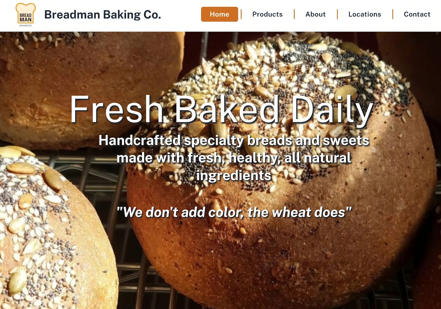
Breadman Baking Co. is a Chicagoland fixture at multiple farmers market locations throughout the week. After years of relying on social media—where updates were often buried by algorithms—we transitioned the brand to an owned website mirroring the Breadman’s steady, reliable presence. The goal was to create a space that feels like a weekly meeting with friends, ensuring the brand’s community-oriented grit is felt online as clearly as at a market stand.
The visual identity reflects the baker’s quiet confidence and quality ingredients. We selected a palette representing the warmth of a perfect bake and the softness of the dough, using warm orange and gold tones to complement the logo. Combined with an expert yet neighborly voice, the site acts as an extension of a master who trusts customers to recognize quality without being shouted at.
Result
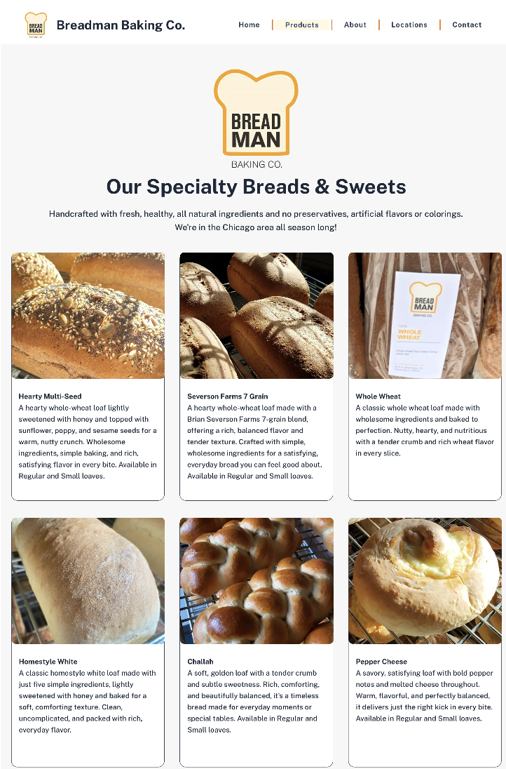
The launch of breadmanbaking.com established a time-tested, reliable destination for customers. By centralizing locations and product offerings, we shifted the reliance on social media to a platform that brings customers to the business rather than a feed the brand must depend on to be seen. The site now serves as an honest reflection of the Breadman’s craft—simply presenting satisfying, balanced bread to a neighborhood of friends.
The website has provided a stable digital foundation that supports the brand’s presence across its various market locations, offering a professional digital presence that reinforces the Breadman’s reputation as a grounded, trusted neighbor in the community.